快来看,n8n更新了!我们为何焕新n8n品牌
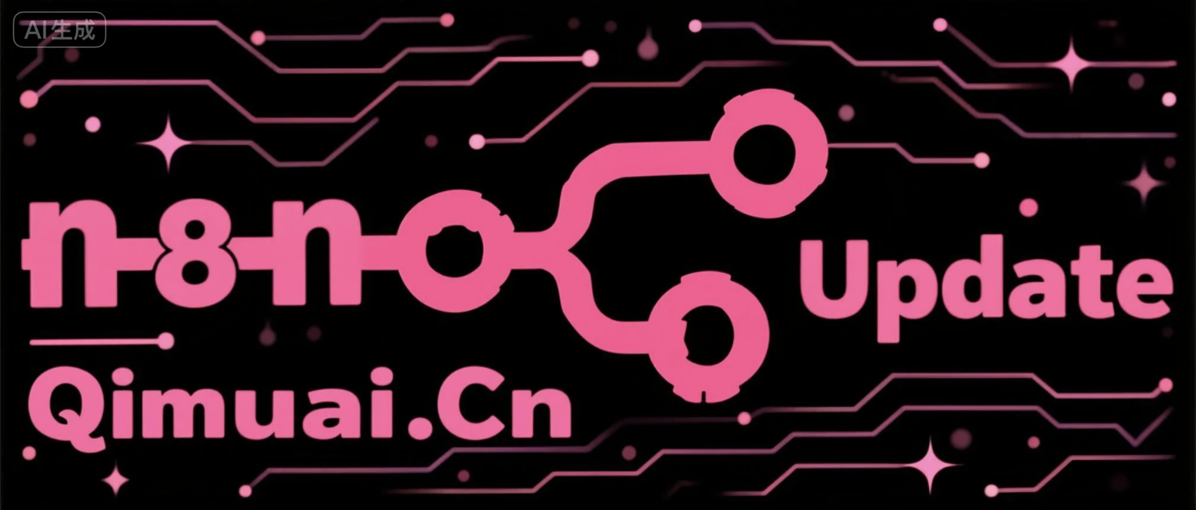
内容来源:https://blog.n8n.io/n8n-brand-refresh-2026/
内容总结:
n8n在10月14日于In The Loop大会上正式发布品牌焕新,推出全新Logo、字体及优化后的色彩系统,粉色仍为核心主色调。此次调整并非推倒重建,而是在原有基础上迭代升级,核心理念与社区生态保持不变。
n8n最初以连接节点为核心理念设计旧版Logo,代表工作流自动化中“连接”的概念。但随着平台从工作流自动化工具发展为覆盖自动化与AI的全球构建者社区,用户在工作流中做出决策、AI智能体执行操作、模型解读信息、数据在系统间流转,节点之间的“活动”正成为更有价值的环节。新Logo因此从展示“连接”转向呈现连接所激发的动态与响应能力,体现n8n从连接工具向具备响应、适应与行动能力的系统演进。这一变化也反映智能体AI已深度融入n8n的产品构建,而非简单附加功能。
新字体延续相同逻辑,兼顾技术精确性与构建者社区的活力,做到专业而不刻板、精准而不僵硬。粉色作为n8n的长期标识予以保留并优化,同时新增一组灰色调以拓展视觉层次并保持整体克制。
以下核心要素保持不变:构建者社区及共建生态;连接、控制与灵活性,社区版及模型选择继续保留;粉色主色调继续沿用;团队身份认同——充满好奇心的构建者,重视协作对象,保持趣味精神。
此次品牌焕新由n8n内部多团队共同参与,管理层提出挑战,社区成员提前看到早期版本并反馈意见。新品牌形象已于10月14日在In The Loop大会上线,将逐步覆盖产品、官网、社区及活动。n8n表示将继续秉持“发布、学习、倾听、改进”的迭代方式,欢迎用户通过论坛反馈意见,共同参与n8n的塑造。
中文翻译:
如果你接触过n8n一段时间,你就知道我们的工作方式。我们发布功能,弄坏点什么,从中学习,倾听用户的反馈,然后把它做得更好。接着再来一遍。迭代不是我们采纳的一种流程,而是n8n得以建成的方式。
所以,我们将完全相同的方法应用到品牌上,也就顺理成章了。10月14日,在我们的In The Loop大会上,我们推出了新标志、新字体和优化后的色彩系统,粉色依然是核心。外观在进化,我们的核心理念不变。
以下是变化了什么、为什么变,以及什么没有变。
先说一些背景
n8n是一个让人们构建工作流和AI智能体、连接工具、数据和模型的平台。它最初是一个工作流自动化工具,如今已经发展为一个跨越自动化和AI领域的全球构建者社区。
这个社区对这段故事至关重要。你们中的许多人在自己构建、贡献或学习的东西上看到过我们的标志。对很多人来说,它不只是一个图形,我们深知这一点。有些人会立刻喜欢上新标志,有些人需要时间适应,还有些人会怀念旧标志。这完全合理。我理解这种感受,因为连我自己也花了一些时间才适应。
为什么换标志
我们的旧标志围绕一个简单的理念构建:连接的节点。它代表了n8n的核心——你把一个东西连接到另一个东西,构建一个工作流,让某事发生。
但看看今天n8n中发生的事。一个人进入工作流做出决策。一个智能体采取行动。一个模型解读信息。数据在系统之间流动。一个流程触发另一个流程。系统的不同部分实时响应周围发生的事。节点仍然在那里,但越来越有趣的部分是节点之间发生的事。
这就是新标志背后的理念。它不再侧重于展示一个连接,而是更多地展示这个连接所催生的活动。它是对n8n从连接事物的自动化工作流,迈向能够响应、适应和行动的系统这一转变的视觉表达。
这一区别对我们很重要,因为智能体AI不是我们硬加到n8n上的东西。它正在成为人们使用n8n进行构建的方式的一部分。随着我们成长为一家多产品公司,我们的品牌需要反映这一点。
字体与色彩
字体遵循同样的逻辑。n8n身处技术世界,所以字体需要精确。但使用n8n的人和技术同样重要:实验、解决问题、分享成果的构建者们。因此字体平衡了这两方面:技术感但不冰冷,精确但不僵硬。同一个故事,不同的媒介。
是的,我们的粉色保留。它一直是n8n的一部分,所以我们对其进行了优化,并在周围加入了一组灰色调,一方面给系统更多层次感,一方面避免它过于张扬。
什么没有变
这是一次点缀,不是重建。我们没有从零开始。我们拿出现有的东西,弄清楚什么仍然重要,然后在此基础上构建。
n8n最重要的东西原封不动地保留着:
- 我们的构建者社区,以及我们共同建立的生态系统
- 连接、控制和灵活性——这就是社区版和模型选择得以保留的原因
- 粉色保留。我们稍微优化了一下,但它仍然非常粉
- 我们是谁:好奇的构建者,在乎与我们一同构建的人,喜欢保持一点趣味
我们是如何走到这里的
n8n各个团队的人都参与了品牌焕新;我们的管理层提出了挑战,社区成员看到了早期版本并告诉了我们他们的想法。我们知道这只是这么大一个社区中的一小部分人,很多人是第一次看到这些。
亲自看看吧
这是n8n的新篇章。但这不是对过去的背离。我们仍然在做我们一直在做的事:构建、学习、倾听,让n8n变得更好。品牌焕新是这一过程的又一部分。
新形象已于10月14日在In The Loop上线。你将开始在产品、网站、社区和活动中看到它。观看品牌焕新视频了解它是如何成型的,然后探索焕新后的n8n。在我们的新品牌指南中获取所有品牌细节。
然后告诉我们你的想法,包括那些你觉得不合适的地方。这就是我们一贯的工作方式:发布它,从中学习,倾听,然后做得更好。品牌也不例外。来论坛找我们,和我们一起继续塑造n8n。
英文来源:
If you have spent any time around n8n, you know how we work. We ship something, break something, learn from it, listen to what people tell us, and make it better. Then we do it again. Iteration is not a process we adopted. It is how n8n got built.
So it makes sense that we have applied exactly the same approach to our brand. On October 14, at our In The Loop conference, we introduced a new logo, a new typeface, and a refined color system, with our pink still at its center. The look is evolving. What we stand for stays the same.
Here is what is changing, why, and what is not.
First, some context
n8n is a platform where people build workflows and AI agents that connect their tools, data, and models. It started as a workflow automation tool. It is now a global community of builders working across automation and AI.
That community matters to this story. Many of you have seen our logo on things you have built, contributed to, or learned from. It is more than a shape to a lot of people, and we know that. Some of you will like the new logo right away, some will need time, and some will miss the old one. That is completely fair. I understand that, as even for me it took some time.
Why the logo changed
Our old logo was built around a simple idea: connected nodes. It represented what n8n was about. You connect one thing to another, build a workflow, and make something happen.
But look at what happens in n8n today. A person steps into a workflow and makes a decision. An agent takes an action. A model interprets information. Data moves between systems. One process triggers another. Different pieces of a system react to what is happening around them in real time. The nodes are still there, but increasingly the interesting part is what happens between them.
That is the idea behind the new logo. It is less about showing a connection and more about showing the activity that connection makes possible. It is a visual expression of n8n moving from workflows that connect things to systems that can respond, adapt, and act.
That distinction matters to us because agentic AI is not something we have bolted onto n8n. It is becoming part of how people use n8n to build. As we grow into a multi-product company, our brand needed to reflect that.
The typeface and the color
The typeface follows the same logic. n8n lives in the technical world, so the type needed to be precise. But the people using n8n are just as important as the technology: builders experimenting, solving problems, and sharing what they have made. So the typeface balances those two sides: technical without feeling sterile, precise without feeling rigid. It is the same story in a different medium.
And yes, our pink stays. It has always been part of n8n, so we have refined it and added a set of grays around it, partly to give the system more range and partly to keep it from running too wild.
What does not change
This is a zhush, not a rebuild. We did not start from scratch. We took what we had, worked out what still mattered, and built on top of it.
The things that matter most about n8n are staying exactly where they are:
- Our community of builders, and the ecosystem we have built together
- Connection, control, and flexibility, which is why Community Edition and model choice stay
- The pink stays. We refined it a little, but it is still very pink
- Who we are: curious builders who care about the people we build with, and who like to keep things a little playful
How we got here
People from across n8n worked on our rebrand; our leadership challenged it, community members saw early versions and told us what they thought. We know that is only a small slice of a community this size, and that many of you are seeing this for the first time.
See it for yourself
This is a new chapter for n8n. But it is not a departure from what came before. We are still doing what we have always done: building, learning, listening, and making n8n better. The brand refresh is another part of that process.
The new identity went live on October 14, at In The Loop. You will start seeing it across the product, the website, our community, and events. Watch the brand refresh video to see how it came together, then explore the refreshed n8n. Get all the brand details on our new brand guidelines.
And then tell us what you think, including the parts that do not work for you. That is how we have always worked: ship it, learn from it, listen, and make it better. The brand is no different. Come find us on the forum and keep shaping n8n with us.
文章标题:快来看,n8n更新了!我们为何焕新n8n品牌
文章链接:https://news.qimuai.cn/?post=5351
本站文章均为原创,未经授权请勿用于任何商业用途